Mesmertising

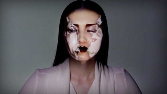
It hard to create. Even harder to create work that gets people to stop and engage. We filter out so much of the marketing and visual din that only the truly different and unique can penetrate. Universal everything seems to have broken the code. Matt Pyke, UE’s founder and creative director, appears to employ much more of an organic, fluid aesthetic throughout his work. This piece for Hyundai was created by capturing a dancer’s movements, then transforming the motion capture data into a digital sculpture.

Marketers would do well to develop creative that is less direct in terms of specific messaging and selling and rather develop unique creative that supports a brand image which is more aligned with their larger values, culture and meaning.

The video wall premiered at Vision Hall in South Korea in 2013. It was 82 feet high and 13 feet wide with 36-channel surround sound.

Via:
11/23/2014 |
0 COMMENTS |
Tags: art, brand, motion, video
I HEART MARTY

Love this piece by Marty Neumeier. Nobody seems to be able to distill complex ideas to their quintessential essence like Marty. His book, The Brand Gap, is simple and brilliant. It really gets directly to the heart of what’s important in brand building. And, he’s generous with his content. While I’d encourage to buy the book, he’s posted it virtually verbatim on SlideShare. He’s quite prolific with several books, workshop DVD’s, blogs and more. Dig deep.

11/17/2014 |
0 COMMENTS |
Tags: book, branding, reference
The man who killed the rapidograph

God bless John Warnoc. For without his creation, the Postscript language, we designers may still be dealing with rubber cement, stat cameras, proportion wheels, and yes, the dreaded rapidograph (god, I hated those things).

Warnak’s Postscript was the mathematical engine that let designers translate what was on their screen to the printed page. Its magic was resolution independence. Regardless of scale, artwork or letterforms were always razor sharp. Postscript led directly to the creation of Adobe Illustrator – still the go-to application for virtually every graphic designer on the planet (and where I spend 80% of my time).

Terry Hemphill’s love story to Illustrator, The Adobe Illustrator Story, details its conception, its rise and its meaning to the world of design and beyond.

I’d argue that it was Adobe that did more to ingratiate the Mac as a design tool than, well, the Mac itself. Warnac was to Jobs and the Mac what Gates was to DOS and the PC.

I recall being so mesmerized by Illustrator, that when we finally got it on our first office computer (v.1.1) , I returned the office that night to get some time to experiment with it – on Christmas eve 1987!

Oh, and if you miss those old school design tools, you can still visit them at the forgotten art supplies website

Via:
11/10/2014 |
0 COMMENTS |
Tags: software, video
DOES THIS VAULT MAKE MY FLYING BUTTRESS LOOK BIG?

It’s bewildering to think, how almost a millennium ago, without power, computers or even formal knowledge of  materials strength, these majestic superstructures were conceived, engineered and created.

The photographer, David Stephenson, does a sensational job at capturing both a kaleidoscope of beauty and detail as well as the emotional force of these nobel gothic cathedral vaults.

His book, Heavenly Vaults: From Romanesque to Gothic in European Architecturein addition to outstanding photography, details specific technological achievements and a bit on each vaults history. Oh, and then there’s these.

Via:
10/28/2014 |
0 COMMENTS |
Tags: architecture, Design
BE MOVED

This site from Sony “celebrating artists and engineers” just blew me a way. It’s a sum of its parts idea and although heavy on the product side, it’s completely entertaining and engaging. The renderings, flow, movement – I musta scrolled up and down 20x. From W+K with Assembly Ltd on the development side.

Via:
10/23/2014 |
0 COMMENTS |
Tags: Design, Programming, UX, Website
THE HOMELESS FOUNDRY

I’m always searching for good, handwritten fonts. Lately I’ve been into Jellyka Saint-Andrew’s Queen and Corradine, among others. But The Arrels Foundation, in addition to simply developing some really great typefaces, is doing it with those less fortunate. Packed with real emotion, each of these handwritten fonts benefit the creators – the sans home crowd.

10/23/2014 |
0 COMMENTS |
Tags: CULTURE, TYPOGRAPHY
NEXT LEVEL PROJECTION MAPPING

Nobumich Asai is taking projection mapping to astonishing levels.The technological precision of real-time projection mapping/tracking married with traditional Japanese art combines to soften the technological aspect of the technology and expresses real beauty.

Via:
10/21/2014 |
0 COMMENTS |
Tags: Programming, PROJECTION MAPPING, TECHNOLOGY
Beauty is Embarrassing

At my recent yardsale, I sold a collection of PeeWee’s Playhouse videos – on VHS! That it sold at all demonstrates what a cultural touchstone that series was. I mean, that show ended is run almost 25 years ago – and who the hell still has VHS players (I guess people frequent yard sales do).

Wayne White, one of the creators behind the series, is profiled in an outstanding documentary call Beauty is Embarrassing, by Neil Berkeley.

With his hillbilly twang, Wayne tracks the ups and downs of his life and career with a self deprecating, off-kilter perspective.

Painter, sculpture, puppeteer, typographer, Wayne’s insatiable creative drive – across all mediums – produces an enormously entertaining film. This should be required watching for any creative.

Last I checked, it was no longer available on Netflix or Prime – but find a way to see it. Watch the trailer here.

10/15/2014 |
0 COMMENTS |
Tags: art, CULTURE, video
Respectfully officer, I don’t have to answer that.

Lord knows, I’ve had my share of run-in’s with the po-po (I once spent an afternoon in jail for running a red light on my bicycle – thank’s Gulianni!)

And, given how they tend to be 100% inflexible with a quick hand to punish, my strategy has been pretty simple: don’t say much, be respectful and comply with whatever they ask. But now, armed with clear understanding of my full rights and some of tactics the police employ, I may be more apt to push back – respectfully.

Via: online paralegal programs
10/15/2014 |
0 COMMENTS |
Tags: CULTURE, infographic